Lightroom 2 Beta has a new Detail panel under the development module. The panel has been redesigned in an extremely positive way. We now have a small zoom window that is already at 1:1 so that we can view noise and sharpening changes without adjusting our main view. Also added is a much anticipated chromatic aberration section in between the noise and sharpening areas.
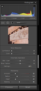
My wish is this: we need to find a way to show the entire detail section, by default in the development window. See the image below from a 20 inch monitor. The default setup for the development module doesn’t allow the entire detail panel to show at one time.
 Other panels have the same issue, but it is much less important than the Detail panel. With the addition of the thumbnail, your attention is on this area while you are adjusting sliders. It is difficult to see the results of the detail and masking sliders with only part of the preview showing.
Granted, Lightroom is so flexible that you can adjust the size of the panel at the bottom, or even hide it which gives plenty of room. The principle should be, however, that the default setup gives you most of what you need.
I think the fix here is simple and would add value no matter what screen size you have. If Adobe would take the three slider sections of the detail window and allow you to shift between each slider section, similar to the HSL / Color / Grayscale panel, two benefits would result:
1. each of the sliders: noise, chromatic aberration and sharpening, could be right underneath the thumbnail allowing efficient view and adjustment of the image (see example below), and
2. the entire area you are working on in the detail panel would be visible in the default development module setup.
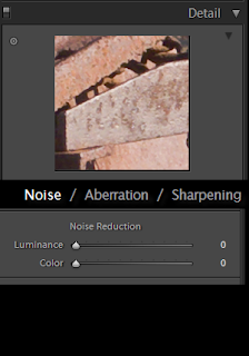
I created a view to show what I would like to see. The first image is with the noise reduction selected:
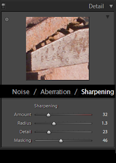
This second image would be with the sharpening selected.
Notice how in each image the section we are working with is directly under the preview window. The alt key could still be held down and the masking and detail previews would show. I think this would be more efficient and more beneficial to a large number of people.
Give me your thoughts and let me know if you think this would be a valuable change as well.