Perceptual Color versus Relative Color Settings

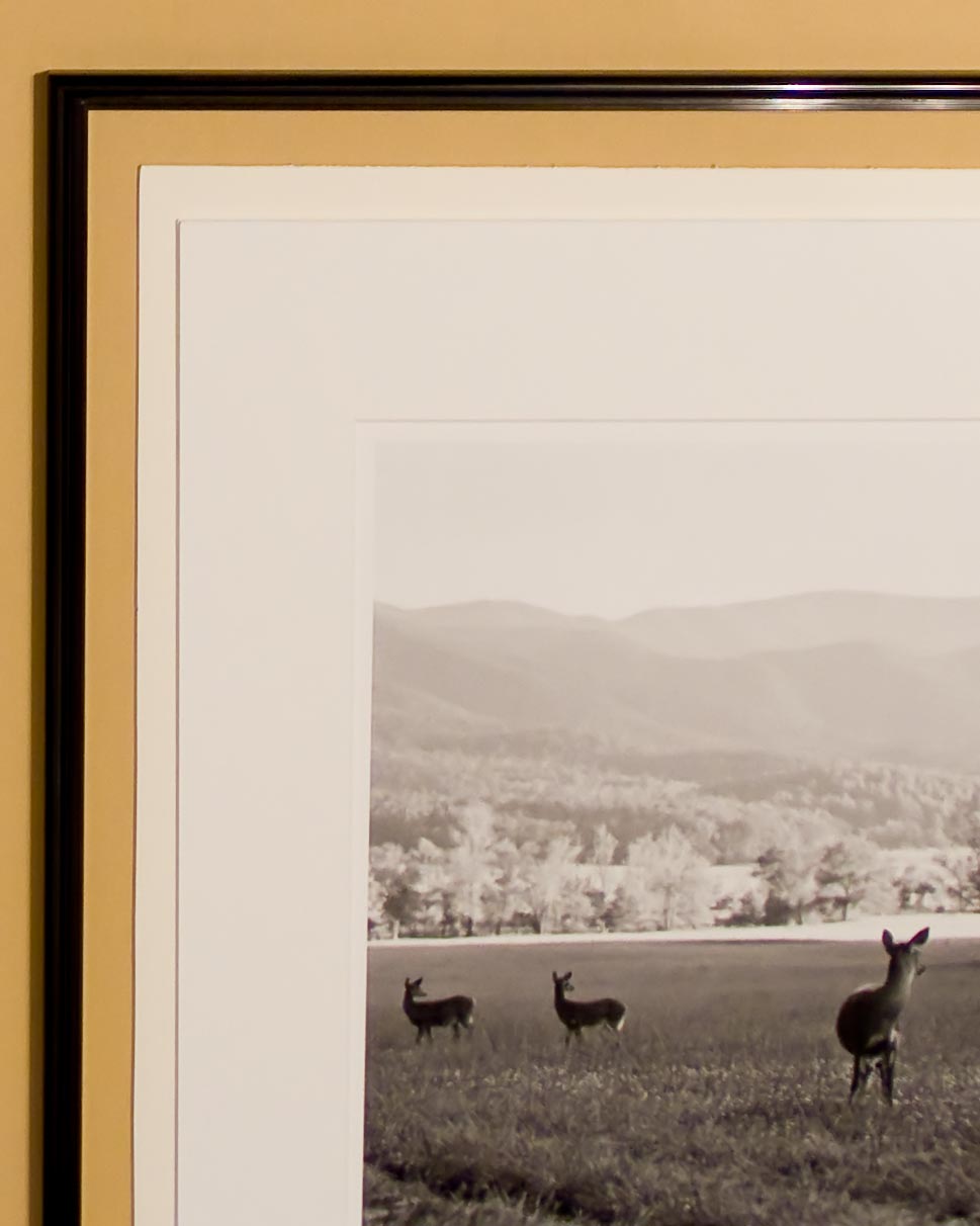
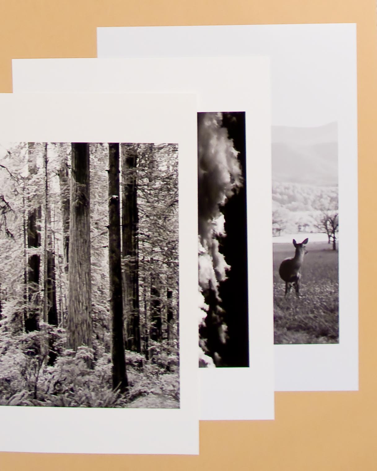
We are constantly faced with the choice for printing photographs of using either Perceptual color or Relative color.  If you print mostly black and white, like I do, then you easily forget which setting does what.  Paper, ink and time are too expensive to waste, so I have put some… 

DPI and PPI: Which is What?

I come across questions and forums where people use DPI and PPI interchangably. Unfortunately, I am also guilty. I have found what I thought was a great explanation of the difference. I have copied the article here and provided a link to the original. DPI and PPI Explained There seems… 

Printing in Lightroom using ICM with an Epson R2400

When you discuss printing in Adobe Lightroom you are liable to be met with a frown and an immediate discussion of how it doesn’t work the way it should. There are many articles on the web and in publications that deal with printing. These articles give you step by step… 

Lightroom Presets

Lightroom makes especially functional use of presets and templates (for web galleries). Photoshop allows a user to add preset tools in a list, but the presets are of all types and to find one a user has to scroll throughout the list looking for the correct tool. Lightroom has various… 

Archival Framing

The second component of our process to provide you with Museum Quality Fine Art is using Special Framing Materials. All of our frames are black and all of our mat boards are white. The black aluminum frame is hand assembled remaining strong and light to avoid warping on larger sizes…. 

Archival Paper

As part of our process to provide you with Museum Quality Fine Art, we start with Special Archival Papers. These papers include a Luster Paper, a Velvet Paper and an UltraSmooth paper. Each has slightly different properties and advantages. Each also has a different archival life ranging from estimated lives… 

Archives